How to choose and pair colours beautifully.
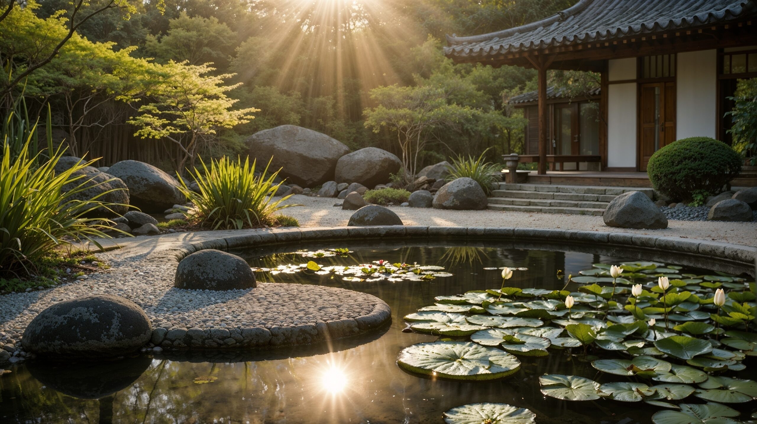
Ever wonder why some gardens stop you in your tracks? The secret often lies in clever use of colour. Designing your garden with a colour scheme doesn’t mean turning it into a paint chart—it means using the natural hues of flowers, foliage, and hardscape elements in a thoughtful way. In this post, we explore how to apply colour theory to your garden, from bold contrasts to calming monochromes, so you can plant with intention and create a garden that feels cohesive, exciting, and uniquely yours.
Outline
- Why Garden Colour Schemes Matter
- Understanding the Colour Wheel
- Colour Harmony Types
- Choosing a Mood for Your Garden
- How to Use Accent Colours Like a Designer
- Classic Garden Colour Combos That Always Work
- How Foliage Adds Texture & Tone
- Using Containers, Fencing & Furniture for Colour
- Seasonal Colour Planning
- Final Thoughts & Tips
Why Garden Colour Schemes Matter
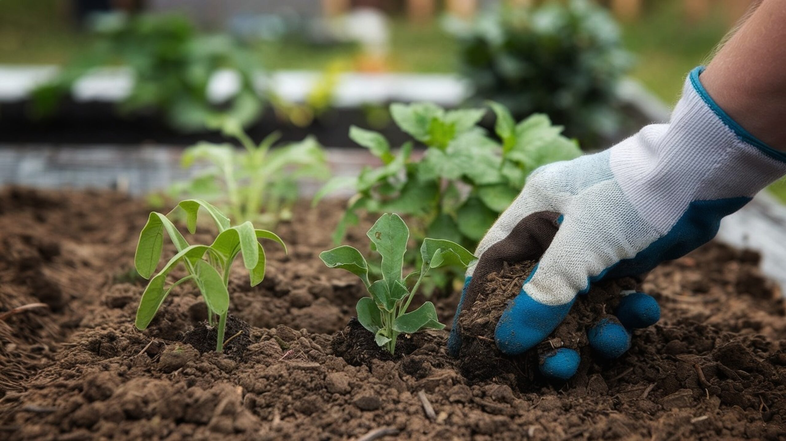
Most people choose plants based on impulse—what looks good at the nursery. But a thoughtful colour scheme makes your garden feel intentional and professionally designed.
Benefits of colour planning:
- Creates visual harmony
- Helps with plant selection
- Makes small gardens feel bigger or more vibrant
- Emphasises seasonal transitions
🎨 Think of your garden as a living painting. You’re the artist.
Understanding the Colour Wheel
Garden design uses the same principles as interior design or art. The colour wheel is your best friend.
| Colour Type | Examples | Use For… |
|---|---|---|
| Primary | Red, blue, yellow | Bold starting points |
| Secondary | Orange, green, purple | Complementary mixes |
| Tertiary | Red-orange, blue-green | Nuanced pairings |
Learn the relationships between colours—especially opposites (complementary) and neighbours (analogous).
Colour Harmony Types
There are a few key approaches to building a colour scheme:
Monochromatic:
- Uses one colour in varying shades
- Creates a calm, elegant look
- Works well in small gardens
Analogous:
- Uses colours next to each other on the wheel (e.g. red, orange, yellow)
- Feels natural and harmonious
- Great for informal or cottage-style gardens
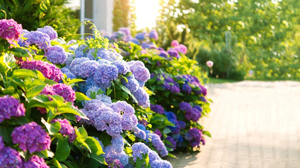
Complementary:
- Opposite colours on the wheel (e.g. purple and yellow)
- High contrast and energy
- Best used in moderation or focal areas
Triadic:
- Three evenly spaced colours (e.g. red, yellow, blue)
- Bold, fun and dynamic
- Can feel busy—use a dominant colour to ground it
Choosing a Mood for Your Garden
The emotional effect of colour is just as important as the visual one.
| Colour | Mood |
|---|---|
| Blues, lavenders, silvers | Calm, reflective, cool |
| Reds, oranges, yellows | Energetic, warm, inviting |
| Greens | Natural, grounding, restful |
| Whites and pastels | Light, airy, elegant |
Want a peaceful retreat? Cool tones are your go-to.
Want a lively social space? Opt for hot, contrasting colours.
How to Use Accent Colours Like a Designer
Accent colours draw the eye, create rhythm, and guide movement.
- Use a bold flower colour at key points: near seating areas, path entries, or centre beds
- Repeat accent colours throughout the garden for cohesion
- Let foliage or neutral hardscaping provide a backdrop for your pops of colour
🌺 Less is more. A splash of magenta in a sea of green can be more powerful than a rainbow bed.
Classic Garden Colour Combos That Always Work
| Combo | Style |
|---|---|
| Blue & White | Timeless, Mediterranean feel |
| Purple & Lime Green | Lush and modern |
| Red & Silver | Regal and formal |
| Pink, Lavender & White | Romantic and soft |
| Yellow & Blue | Vibrant and cheerful |
Plant examples:
- Blue & White → Salvia, Delphinium, Shasta Daisy
- Purple & Lime → Allium, Euphorbia, Heuchera
- Red & Silver → Crocosmia + Dusty Miller
How Foliage Adds Texture & Tone
Flowers get all the glory, but leaves last longer and add depth.
Foliage colour options:
- Green – the classic backdrop
- Silver – softens bold colours
- Purple – adds drama
- Variegated – mixes tones naturally
🌿 Mix different leaf shapes, sizes, and textures to prevent a flat look.
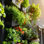
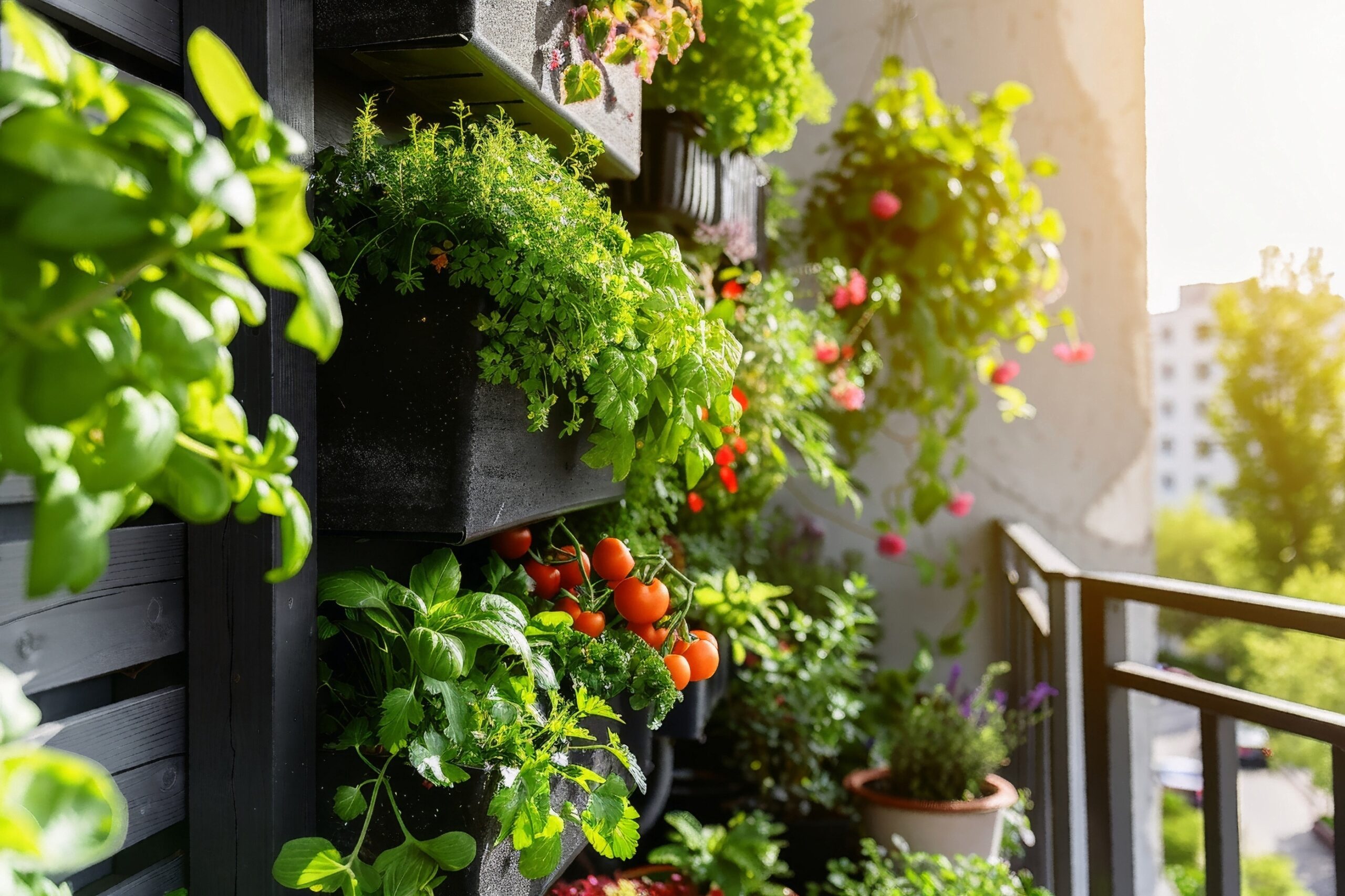
Using Containers, Fencing & Furniture for Colour
You’re not limited to plants—structures can carry your palette too.
- Paint a bench or pot in your accent colour
- Add colourful cushions to outdoor seating
- Use fencing or trellises as a bold backdrop
- Hang bunting or install coloured glass bottles for boho flair
🎨 This is especially useful for renters or small-space gardeners.
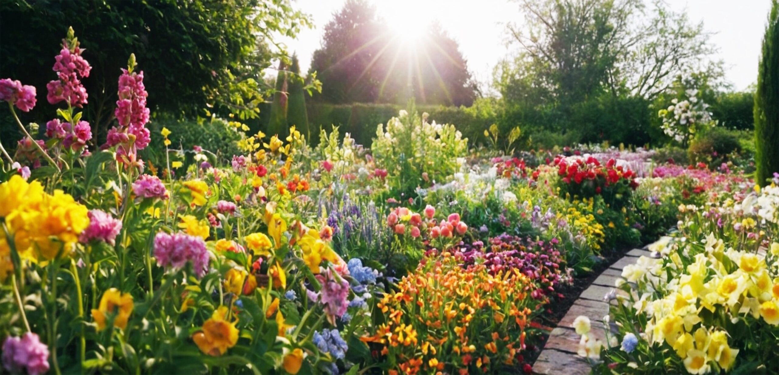
Seasonal Colour Planning
Think about what blooms when—colour continuity keeps your garden looking alive.
| Season | What to Focus On |
|---|---|
| Spring | Pastels, bulbs (tulips, daffodils, hyacinths) |
| Summer | Bold perennials and annuals (roses, coneflowers, salvia) |
| Autumn | Warm tones, foliage (rudbeckia, asters, ornamental grasses) |
| Winter | Evergreen structure, bark colour, berries (dogwood, holly) |
Aim for at least one element of interest per season.
Final Thoughts & Tips
Designing a garden with colour doesn’t require formal training—just a little observation, experimentation and intention.
Quick Takeaways:
- Pick a primary palette before planting
- Use contrast to create impact and calm tones to create flow
- Repeat colours to unify the space
- Let foliage be your unsung hero
Your garden is your canvas. Let colour guide your creativity—and enjoy every petal of it.